
When you give quote wall art enough space to breathe, it becomes more visually appealing and easier to focus on. Proper spacing prevents the design from feeling crowded, making the message clearer and more impactful. It helps your eye flow naturally across the quote, highlighting important words or phrases. With room to breathe, your overall design stays balanced and polished. Keep exploring, and you’ll discover even more ways to make your wall art truly stand out.
Key Takeaways
- Adequate space enhances readability and ensures the quote remains the focal point of the design.
- Breathing room prevents clutter, making the message clearer and more impactful.
- Proper spacing creates visual balance, guiding the viewer’s eye smoothly across the artwork.
- Room to breathe emphasizes certain words or phrases through contrast and hierarchy.
- A spacious layout elevates the overall aesthetic, making the quote wall art more polished and engaging.
When it comes to displaying quote wall art, giving each piece plenty of space to breathe is essential for making a visual impact. If your quote feels crowded or cluttered, it loses its power and becomes hard to read. Instead, allowing room around the text helps your message stand out and invites viewers to pause and reflect. This concept is especially important when considering typography style and color contrast. The typography style you choose should complement the message and be clear enough to read from a distance. Bold, clean fonts often work well, but if you prefer a more decorative style, ensure it doesn’t compromise legibility. When your quote has enough space, the typography can be showcased effectively without competing with other design elements.
Creating visual balance by managing space around your quote also enhances overall design harmony. Color contrast plays a critical role in how your wall art is perceived. High contrast between the text and background makes the quote pop, making it easier for viewers to absorb the message instantly. For instance, a dark font on a light background or vice versa creates a striking visual that demands attention. When you give your quote room to breathe, you also give yourself the chance to experiment with contrast, ensuring the text remains the focal point. Using space strategically allows you to leverage color contrast more effectively because it prevents the design from becoming overwhelming. If your quote is crammed into a small area with minimal contrast, it can become difficult to distinguish the words, diminishing its impact. Additionally, space management contributes to the overall readability and visual appeal of your wall art. Proper typography choices can further enhance the clarity and style of your display.
Furthermore, space around the quote allows you to play with visual hierarchy. You can emphasize certain words or phrases by adjusting size, weight, or color without cluttering the overall design. Proper spacing can also help guide the viewer’s eye and create a more engaging flow. Giving your quote adequate room also makes it easier to incorporate additional elements like subtle decorative accents or minimalistic backgrounds, which enhance rather than detract from the message. This balance helps your quote wall art feel intentional and polished.
Ultimately, giving each quote plenty of space ensures the typography style and color contrast work harmoniously. It emphasizes clarity, boosts readability, and creates a compelling visual statement. When you resist the temptation to fill every inch with text or decoration, your quote becomes a focal point that commands attention and invites engagement. Proper spacing isn’t just a design choice; it’s a strategic move that elevates your quote wall art from ordinary to extraordinary.
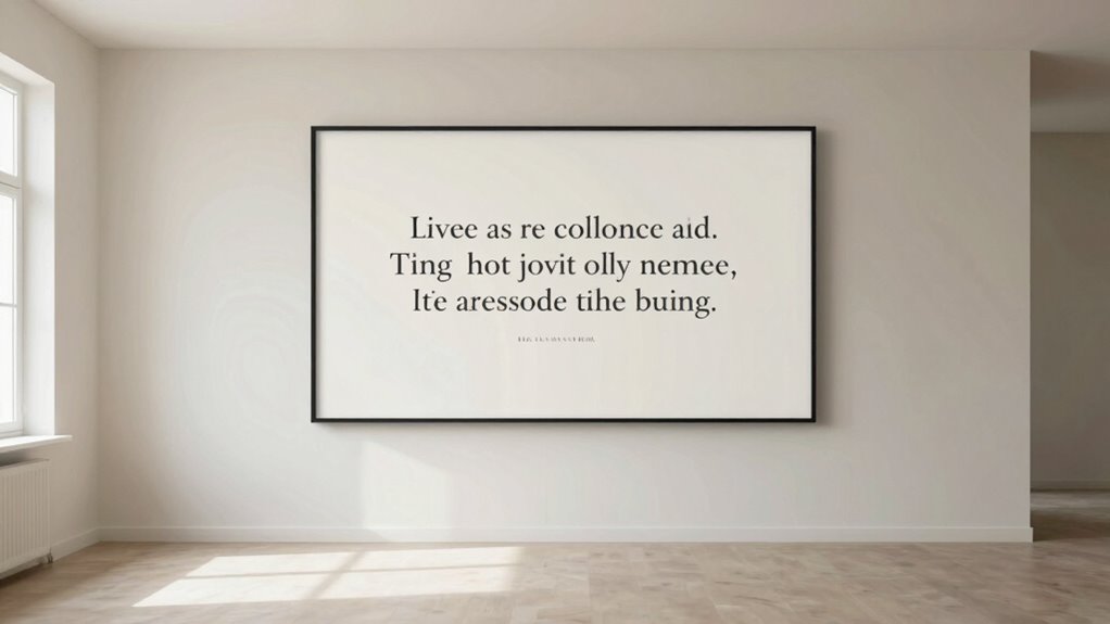
quote wall art with ample space
As an affiliate, we earn on qualifying purchases.
As an affiliate, we earn on qualifying purchases.
Frequently Asked Questions
How Do I Choose the Right Quote for Wall Art?
To choose the right quote for wall art, focus on your personal style and the message you want to convey. Consider typography choices that match your decor and mood. Opt for quotes that resonate with you and can be personalized if needed. Keep it simple and impactful, ensuring enough space around the quote for a balanced look. This way, your wall art becomes both meaningful and visually appealing.
What Are the Best Colors for Quote Wall Art?
For quote wall art, you should choose colors that complement your room’s overall color scheme. For example, a calming blue background with crisp white typography creates a soothing vibe, perfect for bedrooms. Opt for typography styles that match your mood—bold fonts for energy, elegant scripts for sophistication. Keep the colors balanced and avoid overwhelming the space; subtle contrasts work best for readability and aesthetic harmony.
Can Quote Wall Art Suit Small Spaces?
Quote wall art can suit small spaces well if you focus on smart decor placement and space optimization. Choose a single, bold quote that doesn’t overwhelm the area, and give it room to breathe by keeping surrounding walls minimal. Maintaining the artwork proportional to the space ensures it becomes a focal point without cluttering. This way, your quote wall adds personality without making the room feel cramped or crowded.
How Do I Hang Quote Wall Art Properly?
To hang quote wall art properly, start by considering frame placement and wall spacing. Measure and mark where you want the art to hang, ensuring it’s centered and at eye level. Leave enough space around it so it doesn’t feel cramped, especially if you’re using multiple pieces. Use a level to keep it straight, and secure hooks or nails firmly to prevent slipping. This way, your quote art will look balanced and polished.
What Are Common Mistakes to Avoid With Quote Wall Art?
You should avoid cluttering your quote wall art with poor typography choices or mismatched frame styles. Don’t pick fonts that are hard to read or too busy, and steer clear of frame styles that clash with your decor. Make certain there’s enough space around the quote to let it breathe, making it more impactful. Keep these mistakes in mind, and your wall art will look polished and inviting.
large typography wall art
As an affiliate, we earn on qualifying purchases.
As an affiliate, we earn on qualifying purchases.
Conclusion
Remember, giving your quote wall art space to breathe isn’t just about style; it’s about making your message stand out. When you avoid clutter and allow some room, your words become the star of the show. Think of it as giving your message room to breathe—like a gust of fresh air. So, don’t cram your wall—let your quote shine and truly make an impact. Sometimes, less really is more.
minimalist quote wall decor
As an affiliate, we earn on qualifying purchases.
As an affiliate, we earn on qualifying purchases.
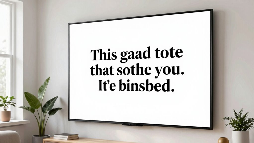
high contrast wall art for quotes
As an affiliate, we earn on qualifying purchases.
As an affiliate, we earn on qualifying purchases.